
In the implementation of analytical reporting projects, creating dashboards (information panels displaying important company data) is a critical element. Unfortunately, the person commissioning the dashboard is often not the end user. Including users in the process by conducting interviews during the automation object survey helps, but does not guarantee a truly high-quality result. Our UX expert Ivan Uspensky will share how to avoid common mistakes and guarantee the best result in dashboards development.
Quality means meeting requirements, but many aspects are assumed implicitly. For instance, it is assumed that the mouse cursor will change shape when hovering over an interactive object on the dashboard.
Moreover, the business value of the created solution can be forgotten. It may seem that if many qualified and experienced people from both sides were involved in selecting data and setting the task for its visualization, the resulting dashboard wouldn’t be bad. However, the risk of creating an unclaimed dashboard is quite high.
To avoid a situation where statistics on the implemented BI solution show that users do not visit what seems to be an important and necessary screen form, it is essential to consider their goals, tasks, and features — i.e., use UX design.
User Experience (UX) design is not common expertise in project teams that create or develop BI systems. Such specialists are much more often found in product teams working for a broad audience. This is logical because, in the B2C market, solutions compete with each other, users are not qualified, and their emotions and actions are crucial for the system’s metrics by which success or failure is assessed (purchases, orders, use of functions).
However, in B2B, the business user cannot avoid using the software they need to work with according to their job responsibilities. Poor task-solving efficiency is more likely to result in the user being penalized rather than in a review of approaches to the user interface and interaction patterns. Therefore, resource costs in the project team for UX design seem excessive — such work is not planned (and therefore not conducted).
Often, UX and UI competencies merge into one and are perceived as “beautiful but unnecessary,” especially if the visual customization of the system is not assumed. However, applying UX design practices significantly ensures the usefulness of the created solution by creating screen forms from and for users, not from a set of indicators. In turn, the predominantly aesthetic and ergonomic components (UI) can be applied separately — or not at all — the solution can be based on a platform that includes ready-made visual solutions for all dashboard elements and their compositions.
It is not necessary to include a special specialist in the team; the method described below is quite accessible to a business analyst (just try it!). For complex large projects, however, a partially engaged UX lead oriented towards the specifics of project work with B2B and BI can be beneficial. Their main task will be to develop the information architecture — a comprehensive structure uniting goals, tasks, scenarios, and roles — to create a convenient and concise navigation system allowing the user to easily move through different contextually related dashboards, sequentially solving tasks within the framework of a common complex business goal.
Thus, parallel to the usual and understandable work of ensuring data visualization according to formalized requirements, we can conduct three steps of designing the user experience of working with the future dashboard. This activity is not separate; its results, including intermediate ones, can have a strong influence, for example, on clarifying the set of indicators.
Step 1: Defining Business Goals
The most important and defining step: based on the objective circumstances of employees’ job duties, identify and record business needs and their attributes. The description of business goals can be done as follows (all links to documents are illustrations — just to show how this happens in real life):
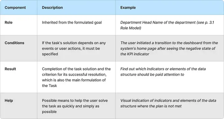
The abbreviation will make these components easier to remember (ranch — a useful object, at least for agriculture).
One or more business goals (depending on the specific dashboard) should be defined in close interaction with the customer and future users. The key feature of this step is the highest possible level of abstraction, ensuring analysis and discussion without binding to the created or developed BI system. The result format can be the table above or simple text.
As we see, functional and non-functional requirements that could otherwise be overlooked are already evident here.
Step 2: Defining Business Tasks
Tasks are the main milestones of the path the user takes from the emergence of the need for data to achieving the goal formulated by us earlier. Each task makes sense; its solution represents a certain business value on its own, but most importantly, they collectively and sequentially lead the user to their goal.
The path from starting work to the goal through several tasks can and should have certain branches and conditions, but we will talk about this a little later.
Tasks can be very diverse, and it is unlikely possible to exhaustively describe all possible ones for information and analytical systems. However, let’s look at examples broken down by main types:
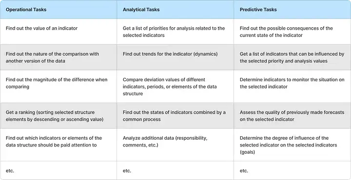
The task is specified by the indicator (or set of indicators) which can be strictly defined or chosen, including automatically and/or under certain conditions (e.g., only those with a negative state deviation to the plan for the selected period).
Tasks can be clarified using the specified indicator attributes with certain necessary values (e.g., you can specify the period or one of the data structure elements, including conditions for such data filtering).
When designing tasks, it is important to continue perceiving the system as a magical “black box,” trying to abstract as much as possible from specific visual solutions. The latter should be subordinated to tasks, not the other way around, as sometimes unfortunately happens (e.g., a chosen beautiful and impressive but unsuitable diagram for the tasks being solved).
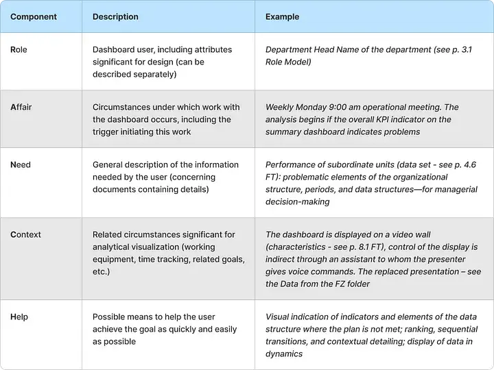
Tasks can be described using the following template:
It may seem reasonable to fix the consequences of solving the task here as well. However, the consequences for the next task will be the conditions for its implementation, so duplication of information can be avoided.
This connection clearly shows that the formulation of tasks is essentially an intermediate stage between the first and third steps.
Step 3: Designing the Scenario
A scenario is the result of designing the user experience of working with a dashboard, connecting goals and tasks into a single system.
If there are few goals and tasks, a tabular or textual form may suffice; however, in most cases, it will be much more convenient to work with a visual structure using any convenient tool (a sheet of paper and a pen, special software for creating diagrams, software for creating boards and connecting placed elements).
Scenarios can be built either from top to bottom or from left to right, depending on the set of elements or your preferences. However, it is advisable to start both from the beginning (starting point, such as user login or navigating to a specific screen) and from the end, where all the business goals described in the first step of the process are located. You can apply ranking here, arranging the goals in descending order of their importance to users or according to some other criteria.
Next, you need to integrate all the tasks we formulated into the resulting scheme, connecting them with arrows in the sequence and with the branches as described in step 2. This way, we get the initial basic scenario diagram, which can be analyzed and necessary adjustments made if needed.
To make the scenario more detailed, we use new elements — user actions: what they can or should do at each moment of their journey from start to finish. For example, this could be selecting a period for display, requesting details, filtering data, etc. Actions are inserted between tasks, linked to them and each other with arrows, and supplemented with branching nodes of the scenario, i.e., conditions — questions that determine the further path when answered.
The final diagram might look, for example, like this:
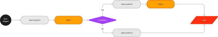
When certain conditions are met (e.g., indicating a failure to meet a plan for an indicator), the user performs an additional action, and an additional task is resolved.
The scenario is ready. Now we have a tool that allows us to both create a truly useful and convenient dashboard (handover to the employee responsible for the layout) and check for any situations where the user might reach a dead end, unable to move further towards their goal.
The priorities set for the goals can be used to determine the order of placement and the share of screen space on the dashboard. Actions indicate which control elements should be on the screen at any given moment during the session with the system, and the tasks connected by the scenario flow guarantee that the goals will be achieved in any case.