
A typical project for implementing a reporting system ends up in meeting room with a number of dashboards. They are the final point where top management looks for data and insights. Let’s discuss what dashboards are and what steps you need to take if you want to make them an invaluable source of truth for your business.
What is Dashboard?
A dashboard is a set of interrelated indicators of any data. That can be a state of a business process or of your organization. Another name for a dashboard is an information and analytical report or panel.
In fact, this is what you look at on a computer screen, your mobile device or a video wall (which can be the case in a large situational center). This panel contains diverse elements — text, graphs, diagrams, graphic forms of different colors, that provide information about the most significant KPIs of the activity monitored or controlled by users.
The data on dashboards should be displayed concisely and in contrast colours, which makes it easy to see what’s important.

Dashboards can be used in a number of cases, but most often it boils down to the formula:
1. a certain fact occurs in the controlled system,
2. information about this fact is recorded,
3. the data is then processed by other systems –
4. after a certain period data is displayed on the screen.
Why you might need a dashboard
You’d be surprised but you regularly interact with dashboards in your real life:
- the screen in the elevator shows the floor you are on, the direction of movement — and can also indicate the excess of the allowed total weight of passengers;
- the dashboard, even in a very old car, shows the distance you have traveled, the current speed, the amount of fuel in the tank, and so on;
- your watch shows the time, and sometimes also the date and the day of the week.
All of these devices are designed to help you make a decision about actions at the right time based on a clear understanding of the situation. Walk up the stairs, fill up the car urgently, cancel an appointment or do something else.

Imagine this: if you lived your usual routine without watch and fuel indicators in your car, how would you know if you are late for your meeting or if you need to go to a gas station immediately.
It seems obvious, but in the business world, data-driven decision making (DDDM) has only been formulated not a long time ago, as opposed to the more “classic” approach of Highest Paid Person’s Opinion, i.e. making decisions based on (someone’s) opinion.
How to develop a dashboard
You might not believe it but you can design a dashboard yourself- using standard Microsoft Office applications. First, make a nice slide in PowerPoint, fill it with your data, include charts and graphics (there’s plenty of examples on the Internet).
Next, set up automatically updated objects (date and time, graphs and charts) and connect everything you need to the source in your Excel file.
Now when you update the values in your spreadsheet, your handmade dashboard will show the current picture.
You can also bring together several slides and, by inserting hyperlinks throughout the document, give users a possibility to drill down on the selected data set.

However, you should not think of these dashboards as an ideal solution. This is due to the fact that in order to design and develop a usable dashboard a number of competences should be brought into place.
Who can do it the best way
The process of creating a dashboard should start from the user — the consumer of information. It is their goals, their issues and their practical tasks that the dashboard should help to solve. This is the task for a business analyst and UX researcher.
The next step is a detailed study of the solution. A system analyst is added to the team — and together they determine:
– a set of data required to fill a dashboard,
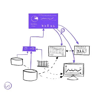
- data sources. These can be information from your corporate systems or someone collecting the data manually. There can be multitude of sources which in the end fill in a dashboard with a summary on what you would like to know.
– methodology for each KPI. That defines what rules influence the indicator, how it is interpreted, who is responsible for this indicator, etc.
Another important role is an architect who determines how technically the tasks of transferring data within the business IT landscape should be solved. He is to decide what protocols are used, where and how the data storage is organized, etc.

A UX/UI designer designs the use cases, controls, and appearance of the dashboard.
The results of this collaboration are documented, approved upon — and given to a developer, who embodies them “in code”, on an existing or newly deployed software platform — most likely in a business intelligence (BI) tool. The final dashboard is thoroughly checked by a test engineer.
The ideal case should also involve a project manager (who monitors the deadlines and resource costs), the coordinator… A whole team, where each player is important!
Best solution for a dashboard?
A well-designed dashboard allows you to get more complex insight into your business. This happens due to:
– the selection of the necessary indicators,
- placing them in a certain order, taking into account their relationships,
– choosing the best forms of visualization, from the text of the desired color to the “heat map” of the regions,
– determining the correct rules for collecting and processing data, including the timing of updates.
Surely, you can make a just one dashboard in a system. However, usually it is a set of dashboards of diverse KPIs all implemented in a BI solution.
Dashboards will definitely help you:
– significantly improve the efficiency of reporting, planning and budgeting processes,
– reduce risks by minimizing incorrect management decisions,
– decrease resource costs by automating the processes of collecting, processing and publishing data.
All to the benefit of your financial results.